Kernel Neurotech · Product Ecosystem · 2021-2022
Designing the software system around a new way of seeing the brain.
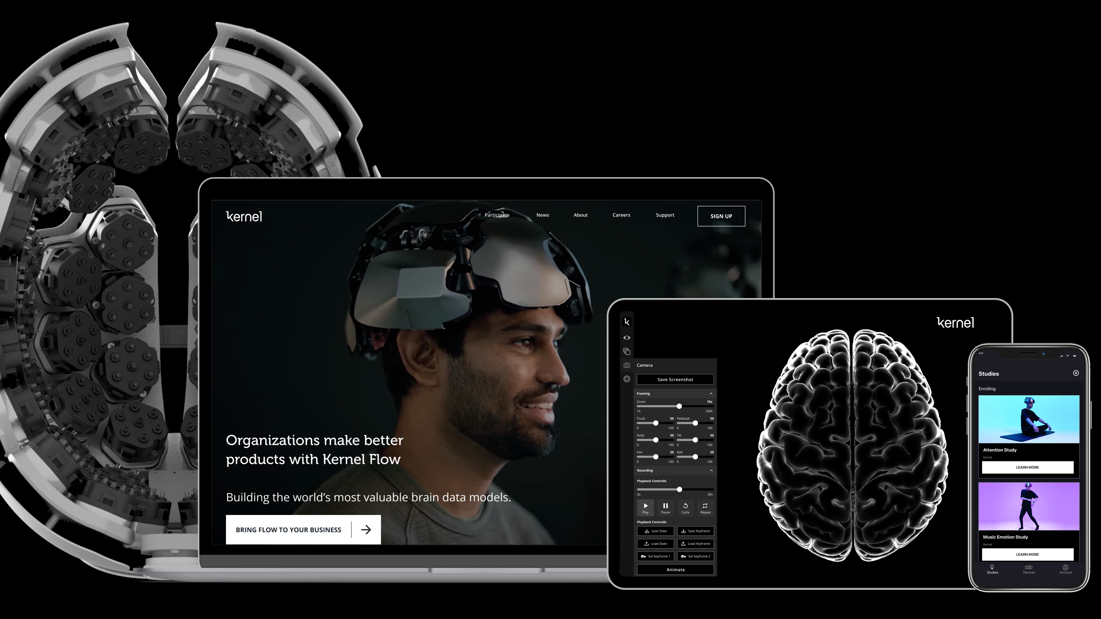
A cross-platform design system connecting a wearable neuroimaging device, participant studies, research operations, neural tasks, and 3D data visualization.
monthly active users
Documented result from the public portfolio record.connected product surfaces
Marketplace · App · Portal · Tasks · Mind's Eyecore audiences
The same system had to serve people in studies and teams running them.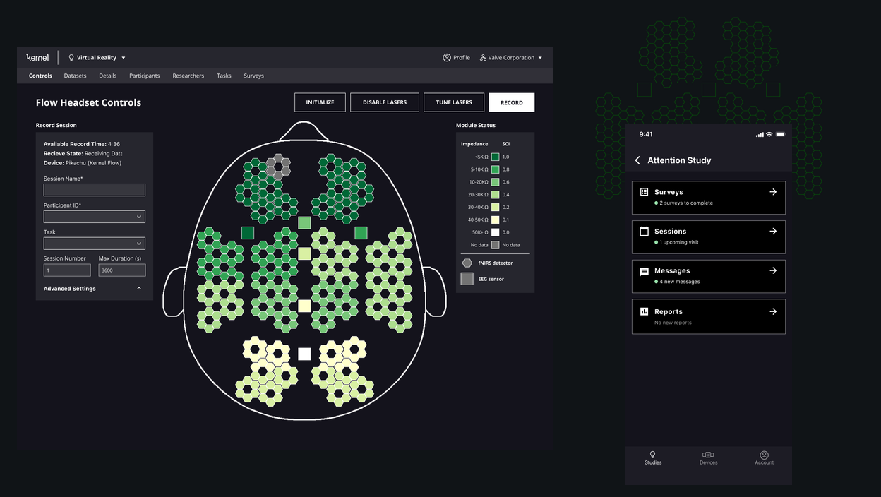
01 / Ecosystem
A company-sized system, not a single product.
Kernel was building a new category of neuroimaging product. The software had to make a headset, study marketplace, participant app, researcher portal, experimental tasks, and data visualization tools feel like parts of one service rather than a collection of disconnected prototypes.
The design challenge was structural: preserve the needs of each surface while making the whole system legible. Participants needed clarity and trust. Researchers needed operational control. The company needed a reusable platform that could keep pace with new science.
Related system principle: shared foundations without forced uniformity.02 / Role
Leading across product, research, and engineering.
As Product Design Lead, the work spanned product strategy, UX architecture, visual systems, research operations, and cross-functional decision-making. Kernel's product questions were rarely isolated to one screen. A small workflow decision could affect participant onboarding, researcher scheduling, data quality, support operations, and the credibility of the science.
That made design a coordination layer. The job was to help teams move from promising experiments toward reusable systems: clear narratives, visible workflow states, consistent interaction models, and product surfaces that could evolve without breaking trust.
Insight
Strategy means bringing a mutable system through change.
The strongest design work was not a single perfect screen. It was a repeatable way to make technical complexity understandable across audiences, product surfaces, and scientific uncertainty.
03 / Audiences
Two audiences with opposite definitions of clarity.
Participants needed emotional clarity: what am I signing up for, what will happen, how long will it take, and what value do I get back? Researchers needed operational clarity: who is eligible, who is scheduled, what tasks are complete, where the data is, and which sessions need attention.
The system had to serve both without confusing either. That meant designing a shared service model with different surface languages: calm guidance for participants, dense control for researchers, and consistent underlying states between them.
04 / Marketplace
Designing the connections between surfaces.
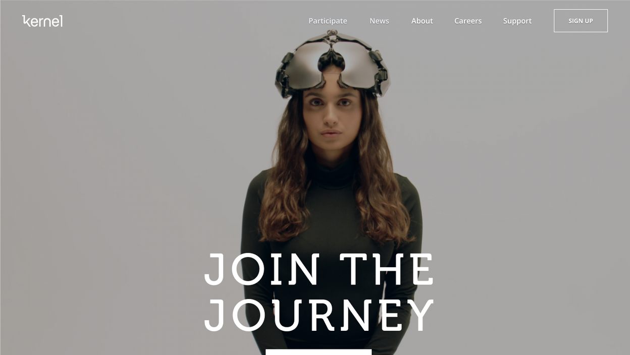
A participant might first encounter Kernel through marketing, then evaluate study eligibility, schedule a session, complete neural tasks, and receive a personalized report. Each moment needed to feel like part of one journey, even when the underlying systems were owned by different product and research workflows.
The design system made those transitions visible: consistent status language, modular cards, predictable calls to action, and navigation patterns that could bridge public storytelling with private study operations.
05 / Participant journey
Trust, commitment, coordination, and value.
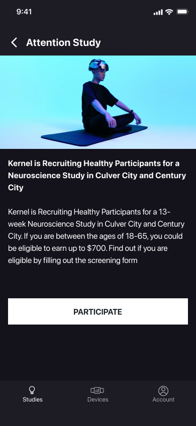
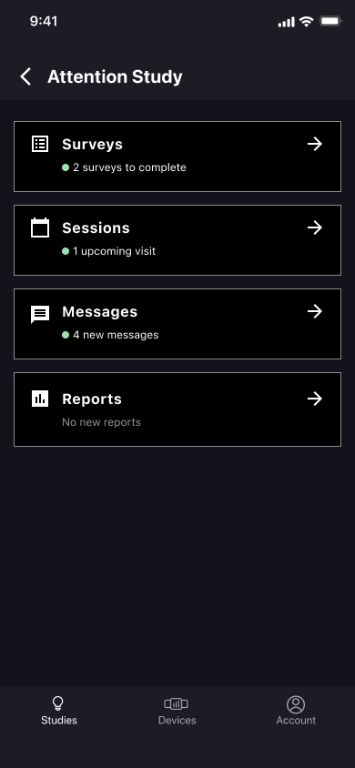
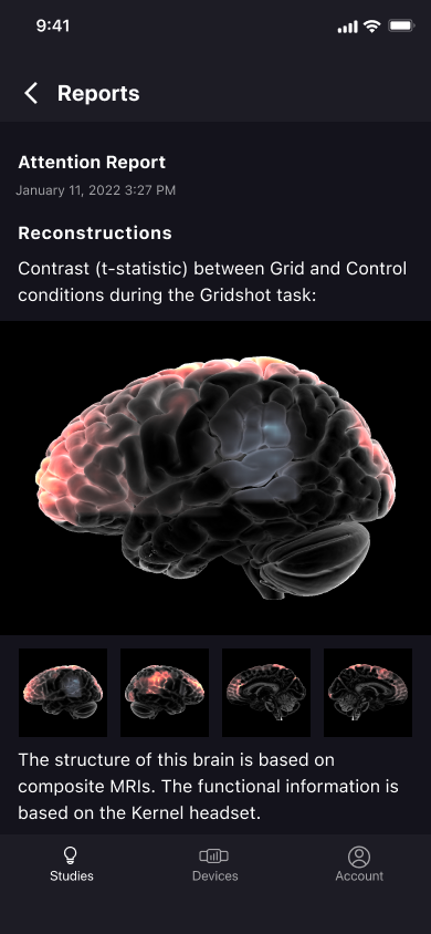
The participant app had to make a scientific protocol feel understandable. It needed to explain eligibility, set expectations, coordinate study visits, guide tasks, and return value through reports without making people feel like they were navigating a lab tool.
That meant simplifying the journey into a progression of trust: first clarify the study, then invite commitment, then coordinate the visit, and finally provide a meaningful report that connects participation back to personal value.
06 / Research portal
A control center for longitudinal studies.
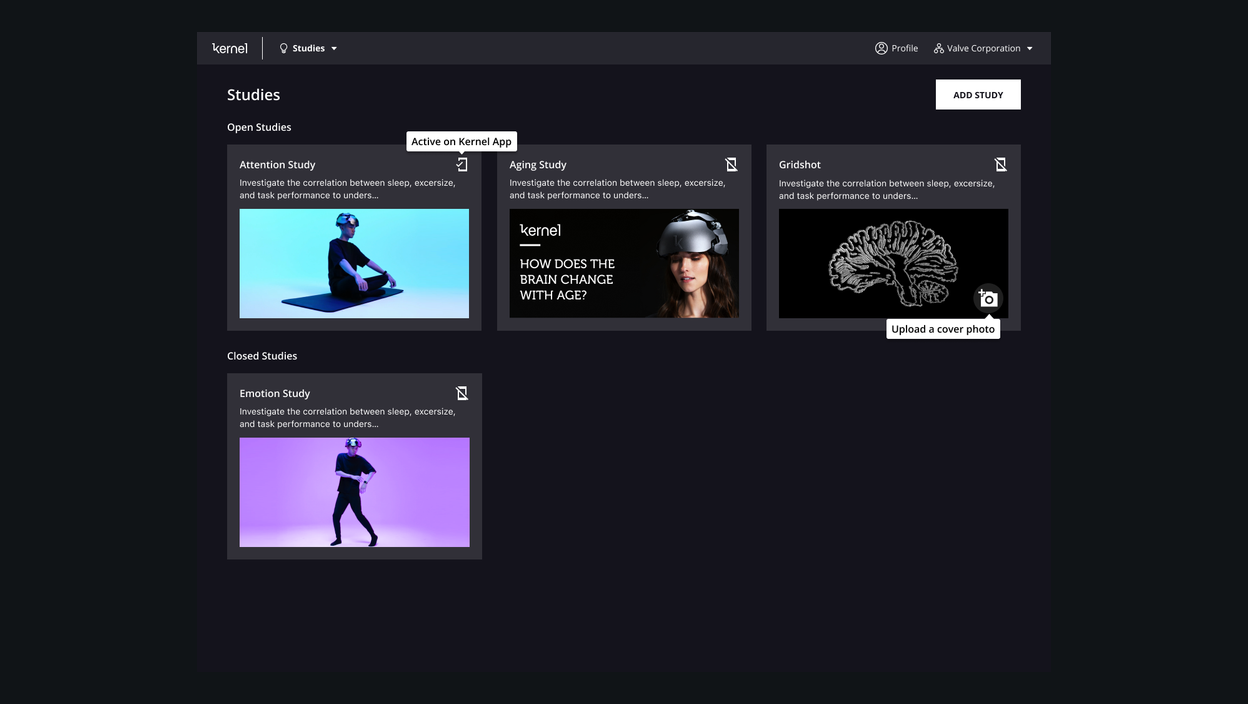
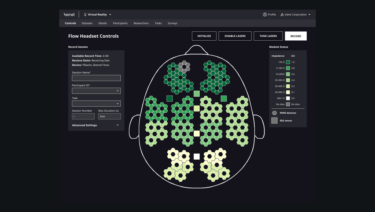
Researchers needed a command center for work that unfolded over time. The portal had to coordinate participant status, schedules, sessions, task completion, data quality, and review workflows without requiring teams to reconstruct state from scattered tools.
The design centered on readiness and exception handling. Instead of treating every session as a static record, the portal made the next action visible: what is ready, what is missing, what changed, and where attention is needed.
07 / Neural tasks
Experimental precision as an interaction constraint.
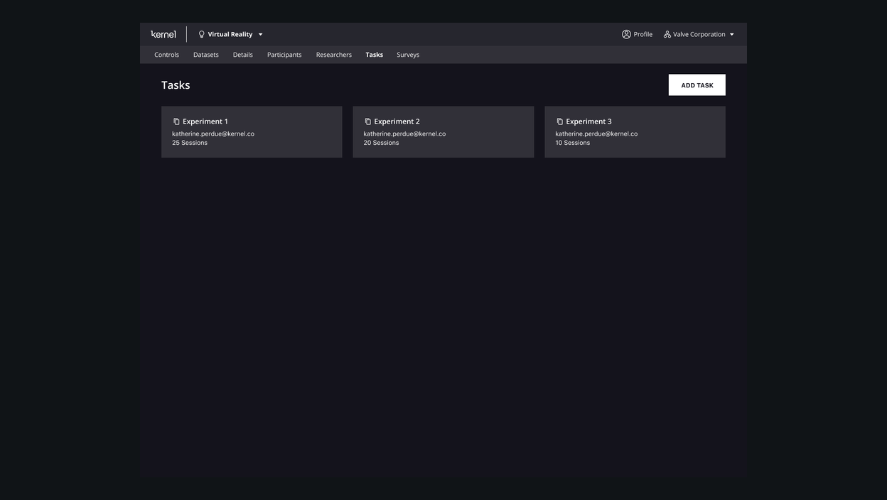
Neural tasks were not normal app flows. They were experimental instruments where timing, instruction clarity, device state, participant attention, and recovery paths all mattered. The interface needed to keep people oriented without polluting the integrity of the task.
The work translated experimental protocols into a state machine: prepare, instruct, capture, recover, and complete. Each state needed a clear visual language and a known relationship to the research data being collected.
08 / Mind's Eye
Making spatial brain data inspectable.
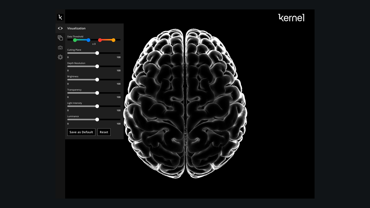
Mind's Eye made the emotional promise of Kernel tangible: brain data could become a spatial object people could explore, discuss, and understand. The design challenge was to make complex signal feel inspectable without pretending that scientific interpretation was simple.
The interface preserved uncertainty through layers, controls, and contextual views. Rather than reducing the brain to a static image, it gave teams a shared workspace for moving between overview, region, signal, and interpretation.
The system works when product differences demand surface-level variation but structural consistency underneath.
09 / Design system
Shared foundations without forced uniformity.
Kernel needed a system that could support public marketing, participant journeys, dense research operations, experimental task delivery, and scientific visualization. A single visual treatment would have been too blunt. The stronger system was a shared foundation beneath intentionally different product surfaces.
Tokens, spacing, color modes, typography, state language, and component behavior gave the ecosystem continuity. Individual products could still adapt density, emphasis, and interaction detail to the job they needed to perform.
10 / Outcomes
A modular platform that could grow with the science.
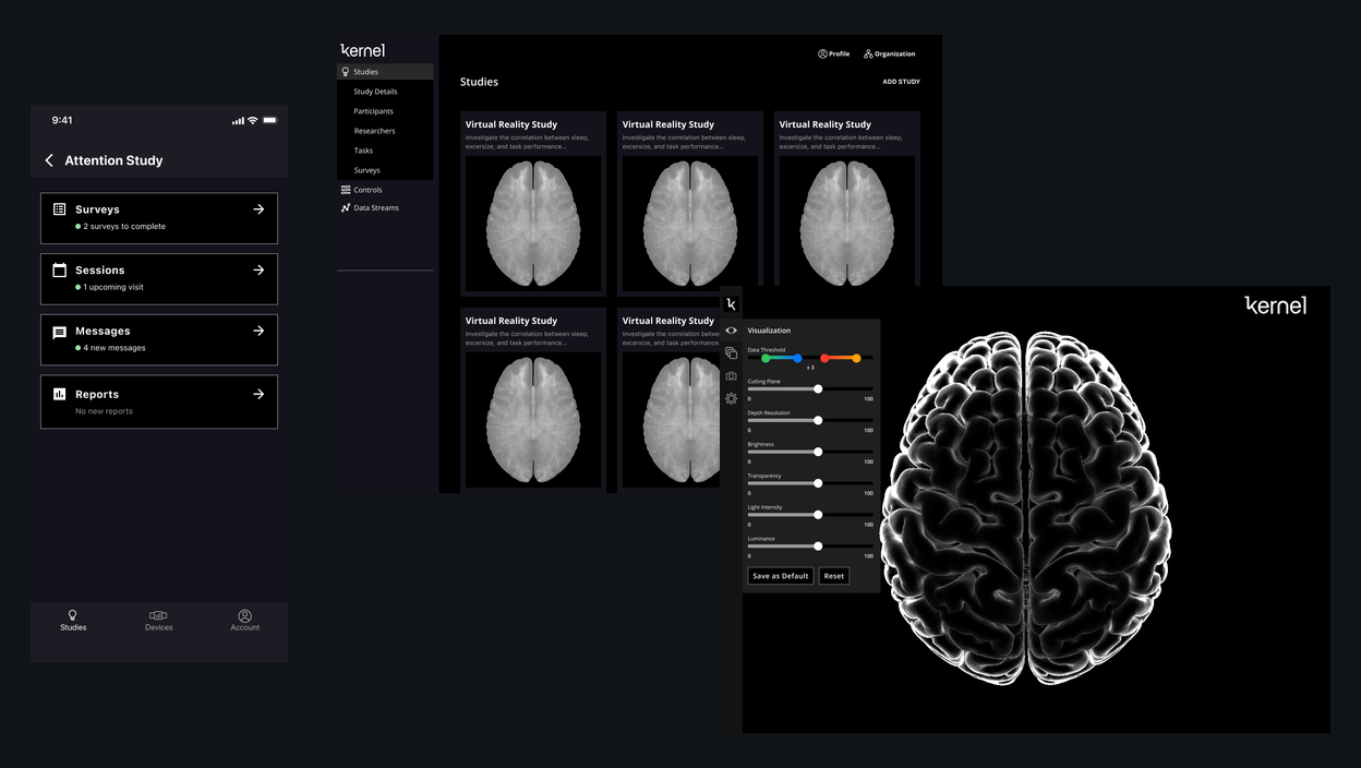
The work helped Kernel move from isolated product ideas toward a coherent platform: reusable study flows, clearer participant journeys, researcher operations, task delivery, and neural data visualization. The documented public result was 10x monthly active user growth.
Source note: use public portfolio claims and published assets only.
11 / Reflection
Complexity should be organized, not erased.
Kernel reinforced a principle that continues to shape my work: complex products become approachable when the system reflects the real relationships between people, operations, and technology. Good simplification does not remove expert capability. It gives each audience the right level of control, then creates shared foundations that allow the organization to evolve without losing coherence. The most durable contribution was not a particular screen. It was a product model that helped a multidisciplinary company see its many tools as one experience and make the next generation of decisions from a stronger starting point.